Yes sir, I'll get right on that, sir.
If your using it for web only I will have to adjust it for the smaller sizes of course. I design for print first without limiting the design for banners, buses, buildings, etc. and then for web afterward as I like to nail down the master art first.
Would you like to tell me what your thinking you want it made for? That way I can give you what you want. For example do you want to use it for the banner at the top of the page which is 550pxW x 175pxH in which case the tagline text will have to lose the gradient and made larger and then sharpened. At those really small sizes the text will have to be replaced...like so;

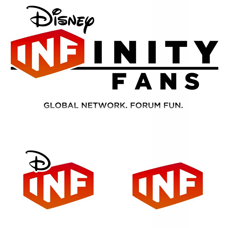
100pxH, 75pxH and 50pxH as requested.
I am happy to give you what you would like but how about letting me know what you need as you seem to have some ideas as to how you would like to use it. =]
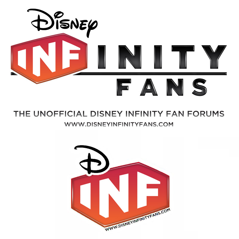
Alrighty, Here is the glossy final logo.
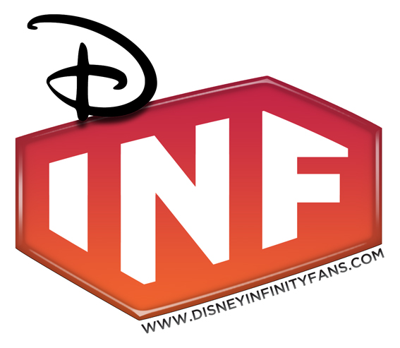
I am not happy with the Icon. I was thinking of removing the white cut-out and adding a drop shadow. Likeadiss...
Ok, Enough of this! I'm off to bed.
Feedback always welcome =]